Celvana
- Client
- Celvana
- Services
- Brand identity, Packaging design
- Year
- 2026
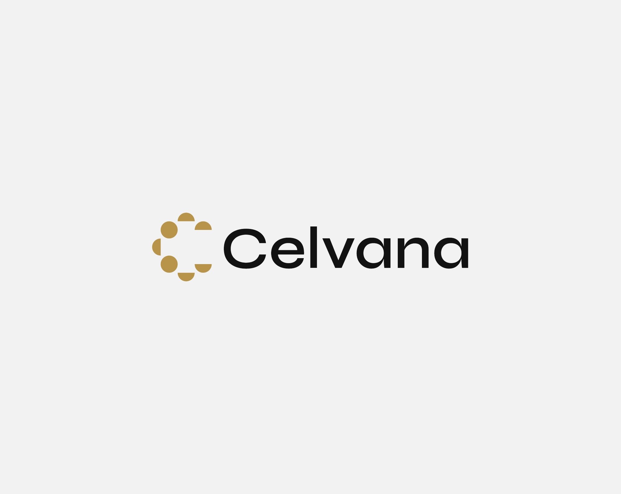
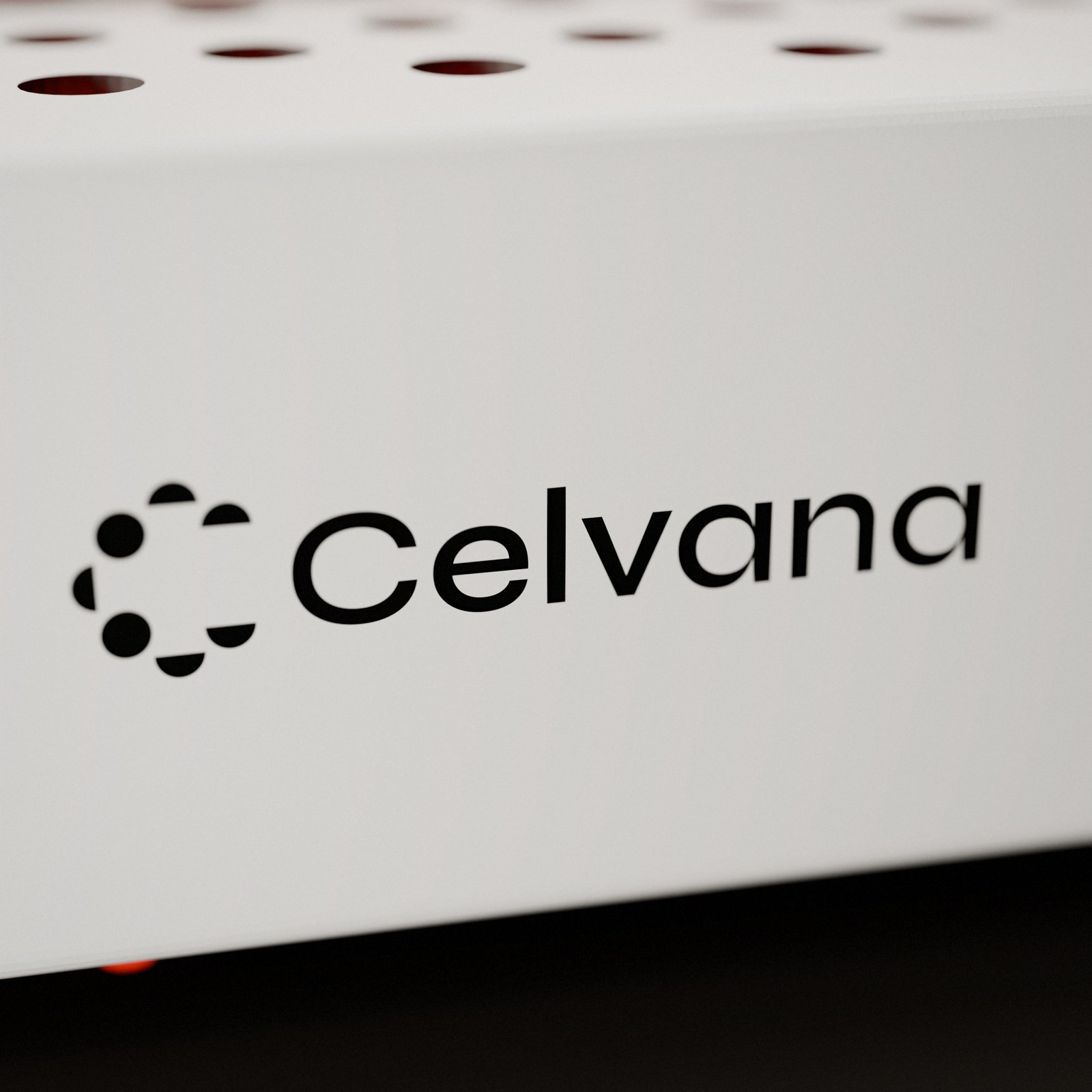
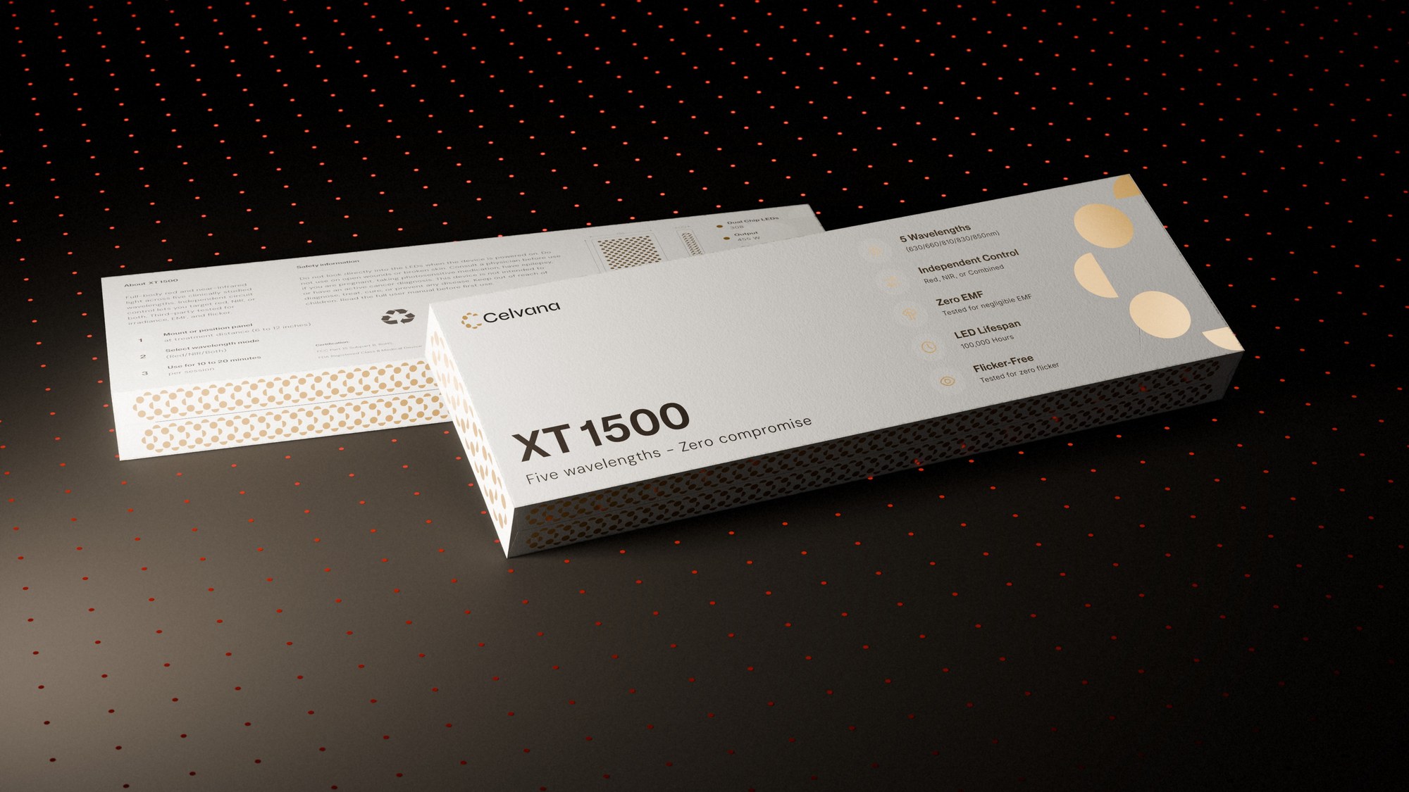
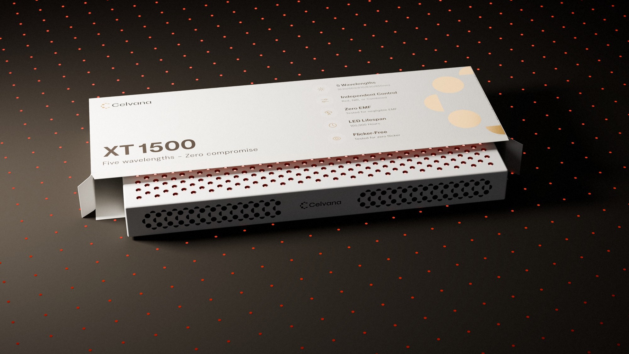
Celvana is a premium red light therapy brand launching in the United States. We built the identity from the ground up: a wordmark and a symbol drawn from points of light, a charcoal, white and gold palette, a pattern system, brand guidelines and the packaging for the XT1500 panel, with the launch visuals rendered in-house.
Challenge
Celvana entered a crowded US market split in two: a few premium brands with high prices, and hundreds of identical, unbranded panels on Amazon. The hardware itself uses a standard panel form, so the identity and packaging had to do the work: make a research-driven buyer trust Celvana as a real company with clinical-grade products, without looking cold and medical or like another wellness supplement.
Approach
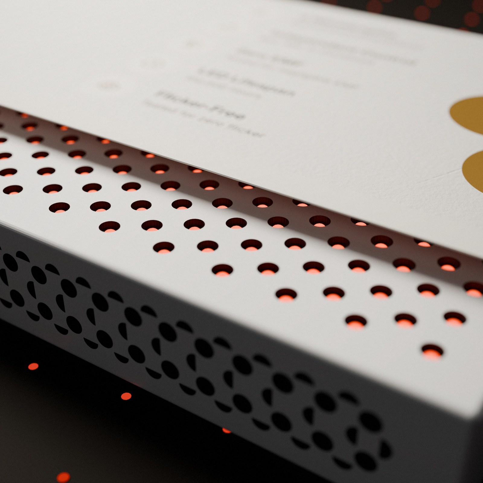
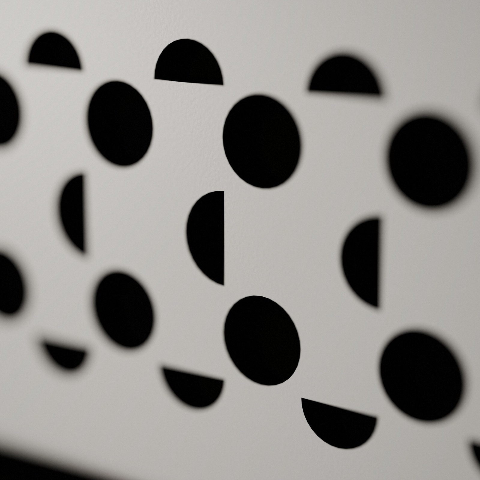
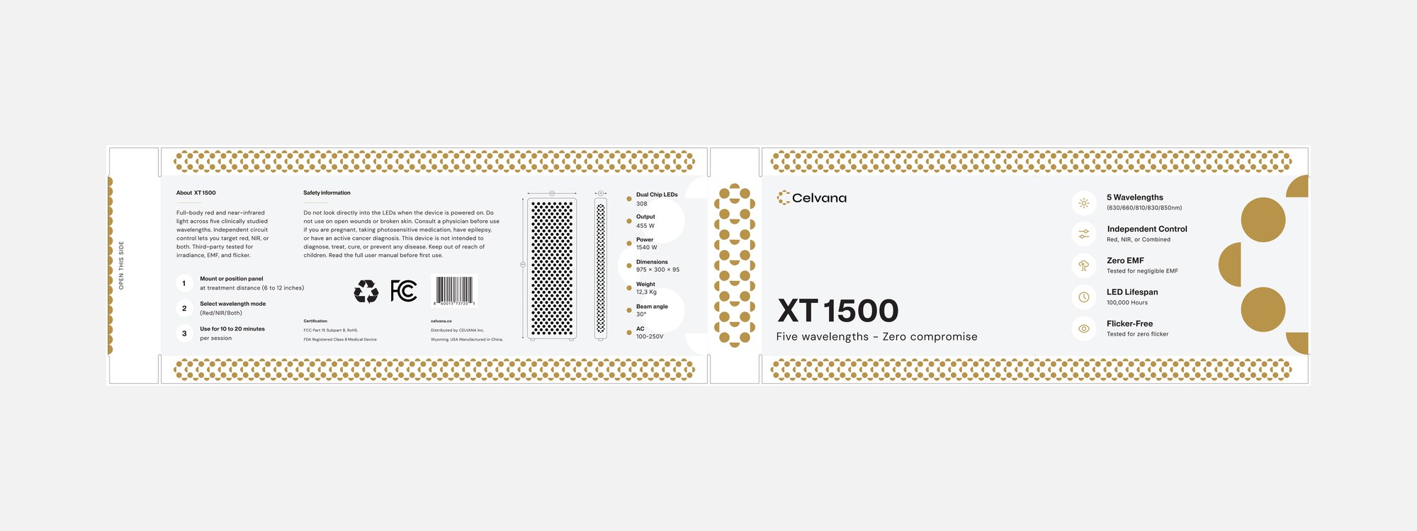
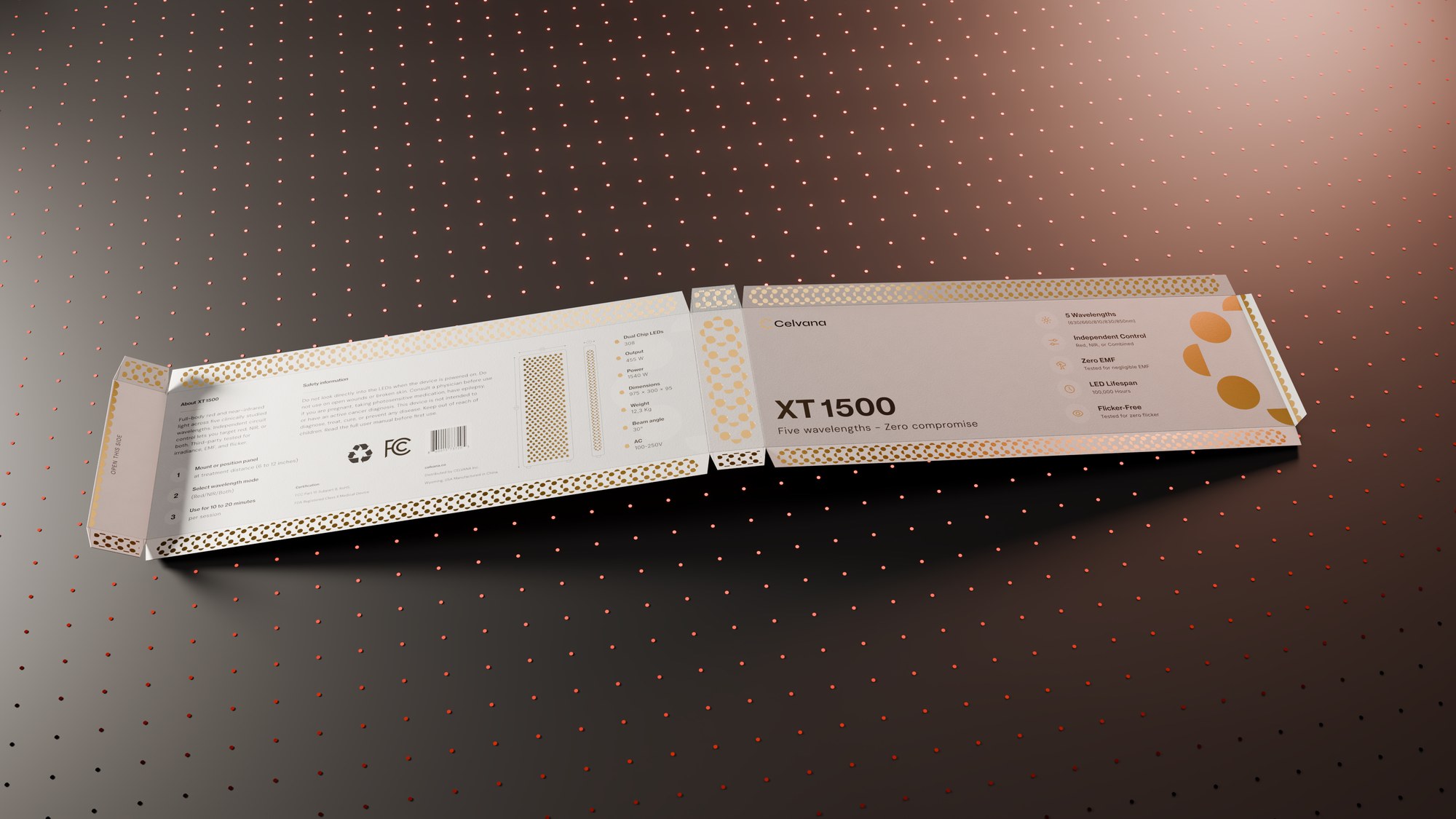
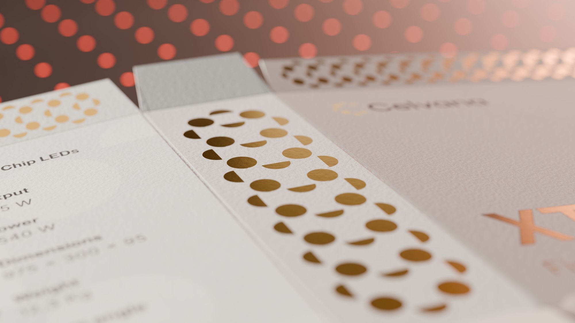
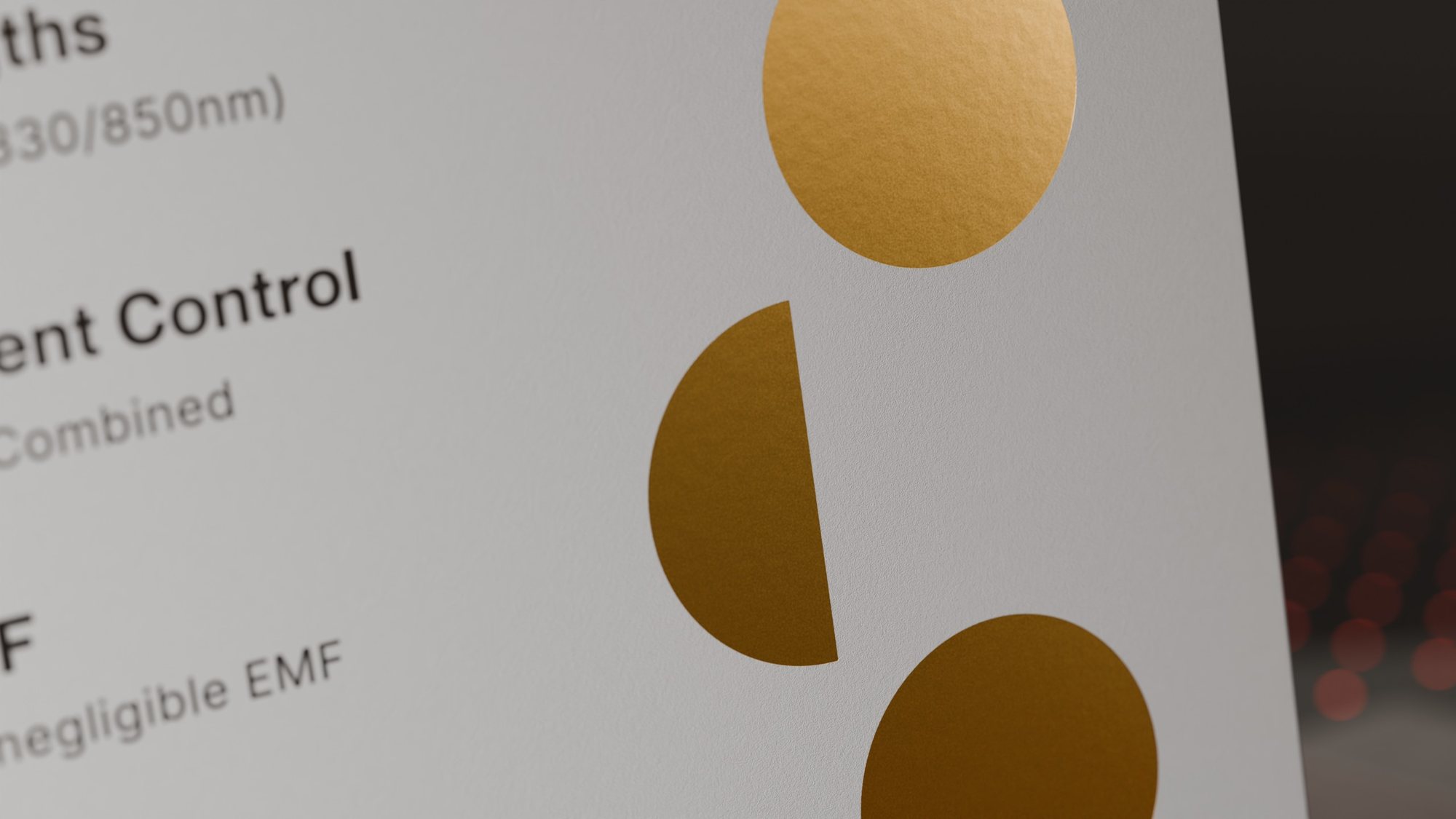
We drew the symbol from circles and half circles on a single grid, like points of light switching on across a panel, and paired it with a calm geometric wordmark. The palette stays restrained: charcoal and white with one warm gold, instead of the clinical blue or loud red the category usually reaches for. PP Neue Montreal carries the headlines, with DM Sans and Inter for text and technical specs. The symbol geometry grows into a family of patterns that run from the brand guidelines to the die-cut and gold-foiled XT1500 box, whose dieline lays out wavelengths, specs and certifications for buyers who compare. We also rendered the launch visuals in 3D.
| All projects | Service | |
|---|---|---|
| Celvana | Branding | 2026 |
| tash.cards | Branding | 2026 |
| Vinted | Iconography | 2025 |
| Grmr | Branding | 2025 |
| Milansa | Branding | 2025 |
| Weardou | Branding | 2023 |
| Lavango | Branding | 2021 |
| Yachting Planet | Branding | 2020 |
| Swimmax | Branding | 2019 |
| Logofolio | Logo design | 2016 |