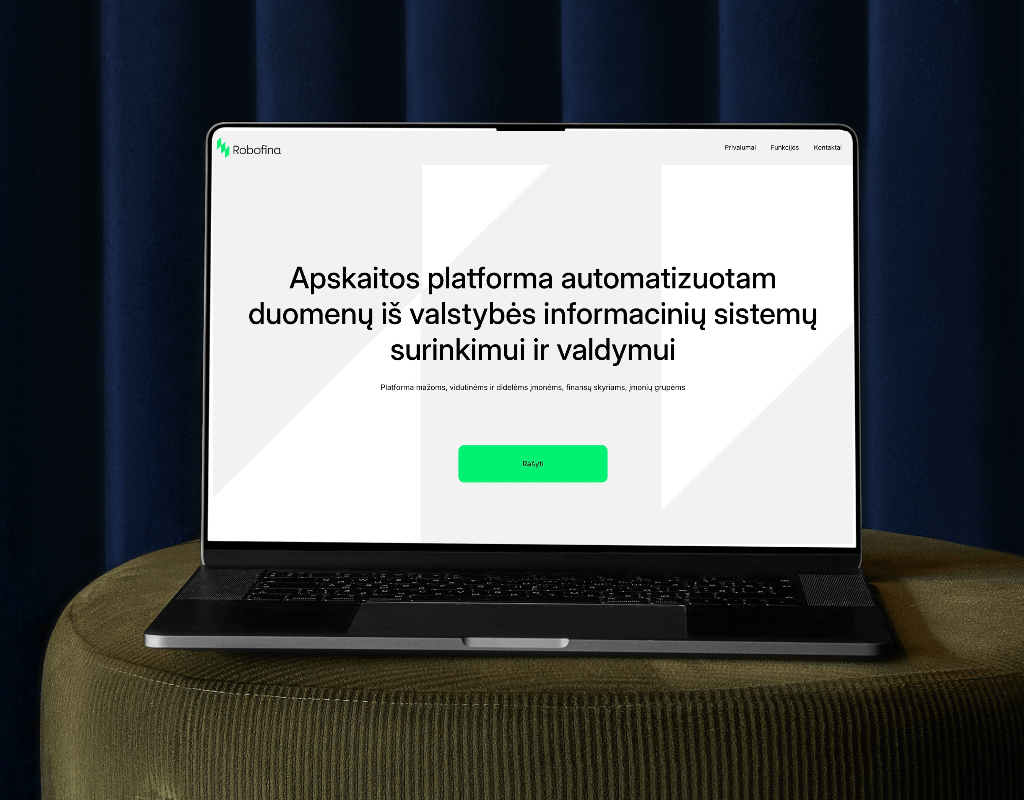

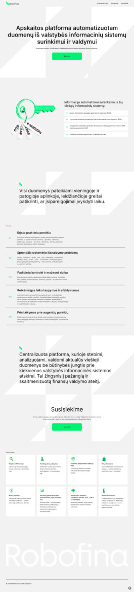


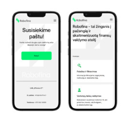
The mobile layout was fully designed and developed in Webflow to ensure smooth performance and easy navigation on any device. Every element from the desktop version was adapted with care to maintain balance, spacing, and readability. The result is a responsive design that looks consistent, performs quickly, and reflects the same level of professionalism as the desktop experience.