

GRMR is a modern digital product designed to help children and students improve their grammar skills through interactive and engaging learning experiences. As the designer, my goal was to create a fresh and scalable brand identity—one that feels approachable yet professional across all digital platforms.
The identity system was built to perform seamlessly across multiple touchpoints: from plugins integrated into platforms like Gmail or Google Drive, to standalone educational apps and writing tools. The branding is intentionally unobtrusive yet distinctive, enhancing the learning experience without ever distracting from it.
Brand identity
The logo mark is built from two simple elements - the letter g and a closing parenthesis ‘)’ - merging to form a smiling face. This symbol represents communication, friendliness, and the joy of learning - turning grammar into something personal and engaging.
Logotype
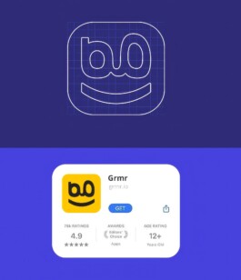
Brand icon
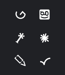
Logo explorations


Icon on browser tab and email toolkit


Color combinations
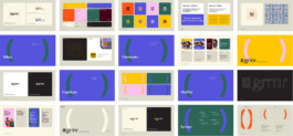
identity book
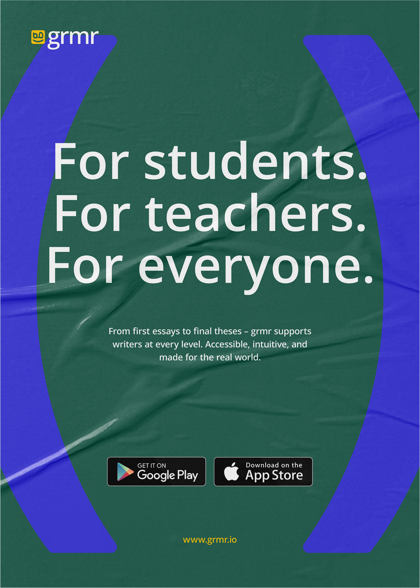
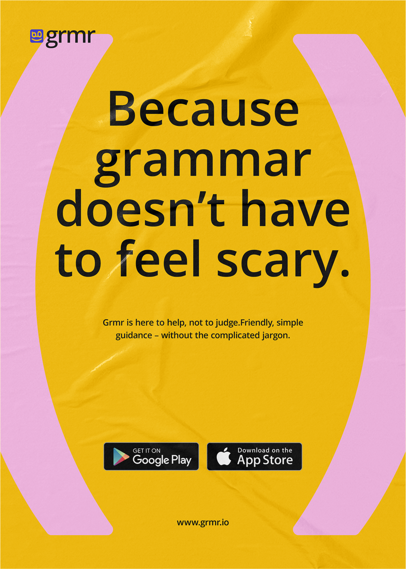
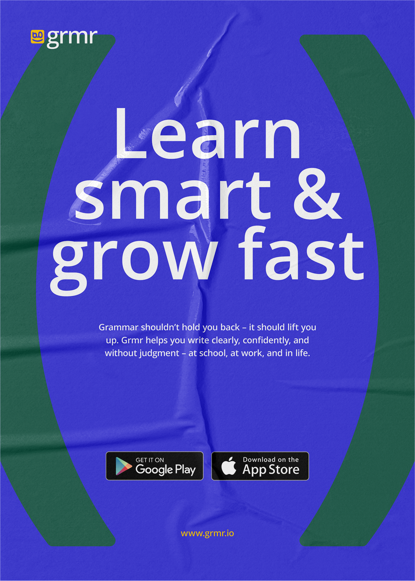
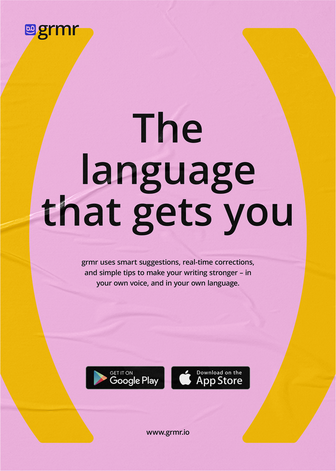
Graphic language and color combinations
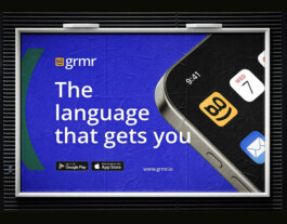
Billboard
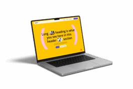
Landing page


GRMR is a modern digital product designed to help children and students improve their grammar skills through interactive and engaging learning experiences. As the designer, my goal was to create a fresh and scalable brand identity—one that feels approachable yet professional across all digital platforms.
The identity system was built to perform seamlessly across multiple touchpoints: from plugins integrated into platforms like Gmail or Google Drive, to standalone educational apps and writing tools. The branding is intentionally unobtrusive yet distinctive, enhancing the learning experience without ever distracting from it.
Brand identity
Logotype
The logo mark is built from two simple elements - the letter g and a closing parenthesis ‘)’ - merging to form a smiling face. This symbol represents communication, friendliness, and the joy of learning - turning grammar into something personal and engaging.

Brand icon

Logo explorations


Icon on browser tab and email toolkit


Graphic language and color combinations

Billboard

Landing page


